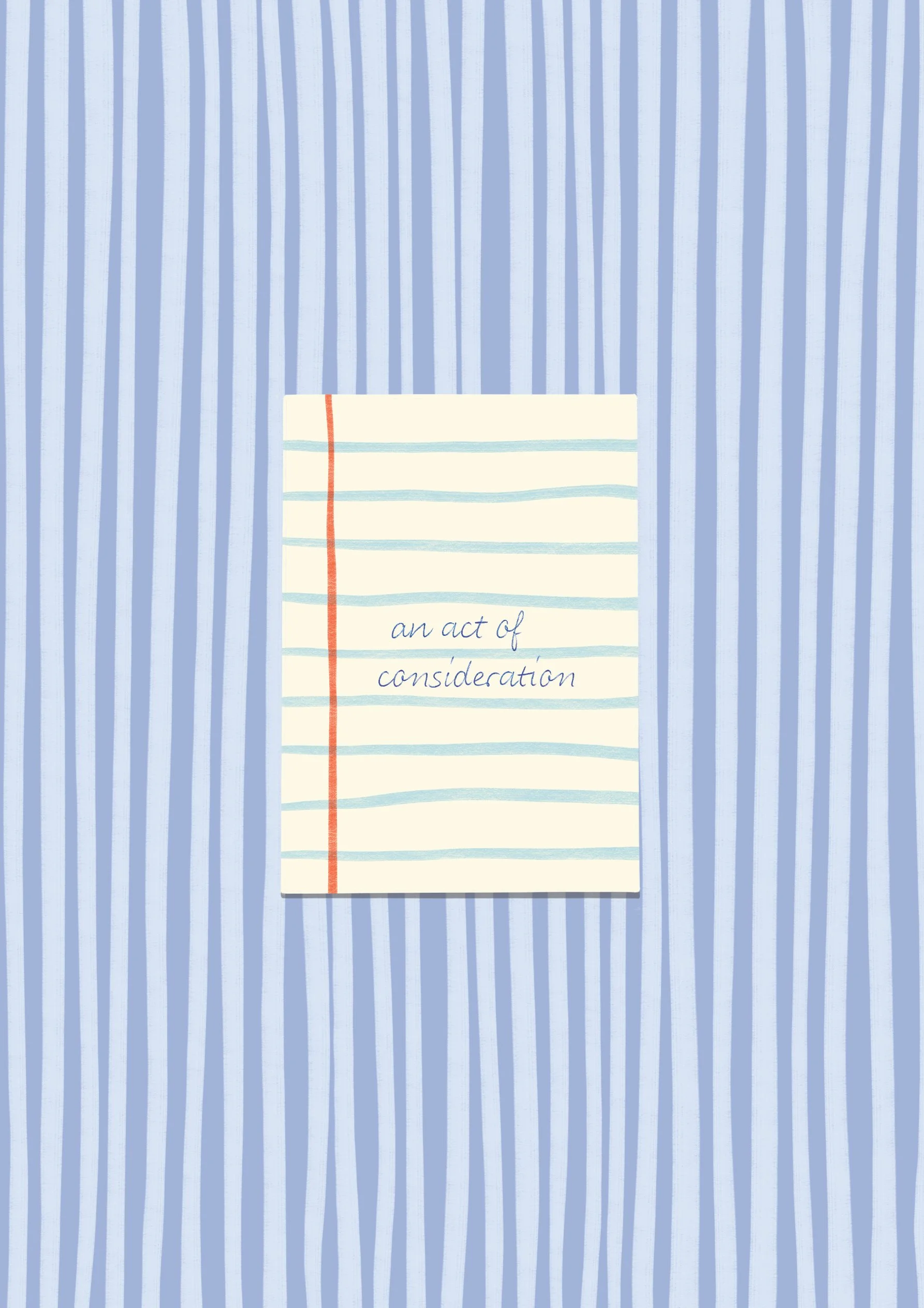
An act of consideration
After reading this, you'll know what typography fanatics mean when they say "fix the orphan". Noticing these small layout disruptions and caring enough to fix them isn't pedantic at all. It's an act of consideration for every person who will encounter our work, a small kindness embedded in the very structure of how we present words to the world.

Reading, redefined
Imagine, for a moment, that letters blur and shift, that a lowercase “g” might be mistaken for a “q,” that a “B” and an “8” are twins in disguise. Imagine that the simple act of reading a menu, a street sign, a prescription label is a challenge rather than an afterthought. For millions, this isn’t an exercise in imagination—it’s a daily reality. Vision impairment makes reading an obstacle course, where clarity is a luxury. And that’s where Atkinson Hyperlegible comes in, not as decoration, but as a bridge. A font designed not just to be read, but to be understood. A font that refuses to let a letter be mistaken for another.

Typography is an invisible art
Typography is an invisible art. When executed well, it disappears entirely, allowing words to do their work—inform, persuade, comfort, inspire—without distraction. It is the quiet architect behind clarity, the unseen force that guides the reader’s eye and mind through meaning with grace and ease. And yet, despite its omnipresence in our daily lives, typography often remains an afterthought, something we engage with unconsciously rather than intentionally.

Very specific recommendations (for winter writing).
Today I’m debuting a new (one-off? recurring? let’s see how it goes!) series on fonts because I have spent too much time toggling between type samples and squinting at letters with suspiciously similar descenders. If I must, you must.
-
January 2026
- Jan 28, 2026 Review and how to give feedback Jan 28, 2026
- Jan 12, 2026 Samen leren tekenen op glas Jan 12, 2026
- Jan 12, 2026 Billie Vos op de bibliotheekramen Jan 12, 2026
-
December 2025
- Dec 15, 2025 TU Delft alumni event Dec 15, 2025
- Dec 12, 2025 Woorden op glas Dec 12, 2025
- Dec 8, 2025 Turn outputs into adoption (and why you might need a designer) Dec 8, 2025
-
October 2025
- Oct 23, 2025 Multilingual typesetting Oct 23, 2025
-
September 2025
- Sep 1, 2025 Website design for healthcare innovation Sep 1, 2025
-
June 2025
- Jun 23, 2025 An act of consideration Jun 23, 2025
-
May 2025
- May 8, 2025 Borrowed light, renewable beats May 8, 2025
-
April 2025
- Apr 24, 2025 Climate change adaptation in European cities Apr 24, 2025
-
March 2025
- Mar 27, 2025 Reading, redefined Mar 27, 2025
- Mar 24, 2025 A few good things in March Mar 24, 2025
- Mar 10, 2025 Typography is an invisible art Mar 10, 2025
- Mar 5, 2025 Sharing energy, building community Mar 5, 2025
-
February 2025
- Feb 26, 2025 Indispensable advice for making a quilted vest Feb 26, 2025
- Feb 21, 2025 Bringing energy renovation to life: a designer’s perspective Feb 21, 2025
- Feb 17, 2025 Seeing clearly: the quiet power of visual identity Feb 17, 2025
- Feb 13, 2025 Drawing clarity: embracing the messy middle through visual facilitation Feb 13, 2025
- Feb 4, 2025 Very specific recommendations (for winter writing). Feb 4, 2025
-
January 2025
- Jan 30, 2025 The art of clear and impactful EU writing Jan 30, 2025
- Jan 30, 2025 Smart Cities, stronger futures Jan 30, 2025
- Jan 26, 2025 Words on glass, poetry for passersby Jan 26, 2025
- Jan 12, 2025 Poetry in motion Jan 12, 2025
-
December 2024
- Dec 20, 2024 Mapping a place of purpose Dec 20, 2024
- Dec 12, 2024 Designing connections, energizing change Dec 12, 2024
-
April 2024
- Apr 20, 2024 Rooted in green Apr 20, 2024
-
December 2023
- Dec 25, 2023 Give a little bit. Dec 25, 2023
-
January 2021
- Jan 20, 2021 Small steps. Without plastic. Jan 20, 2021